

By Carmen Greger
A Logo speaks the core message behind the business it represents; the visual says a thousand words in a moment’s time, in a clear, concise, and shared language, and on a frequency and vibration through which the company and consumer communicate.
A well-crafted logo essentially becomes a ‘magic button’, an easily recognizable, attractive, and trusted symbol, fully embraced by the patron. The magnetism of a top-notch logo proves time and again a vital asset to any brand. This strategic ‘coding’ once established, evolves into an automated, almost effortless optimization of the business’s bottom line.
Perpetual Messaging by marketing logo-laden gear, clothing and other swag is priceless and its impact noteworthy. Not only does a business’s brand have something to say, a unique message or promise to convey, or secret to share with its direct consumer with whom it may have spent countless hours and dollars marketing directly to, those swag-sporting customers are additionally then integrated in daily life and ‘read’ by intermixing passers-by who subconsciously or not, take notice and receive a trendy ‘join the club’ purchase prompt almost instantaneously.
Logos are like Brand Billboards. People, proud as peacocks, become walking advertisements, live signage, organically catalyzing the spreading of your word; They are the messengers, the minions, the brand’s logo becomes a radar, with which the company captures, cultivates, and amplifies a carefully curated niche.
A logo must be unique, innovative, and easily recognizable for the consumer audience and should certainly be eye-catching, creative, and aesthetically pleasing. The more strategically attractive the logo, multi-dimensionally speaking, the more consumers it will attract; it becomes a ripple effect with endless growth potential.
While embarking on the creation journey, consider that a logo should evoke a feeling, be on point with the brand, graphically speaking should be of top quality and high resolution, and it should voice itself clearly without having to make a sound or say a word.
There are countless tones, styles, and vibes that logos project, from traditional, vintage, or classy to modern, hip or edgy and peaceful, serene or healing to excited, invigorating or robust.
There is significant shape symbolism in logo building that provides a very specific and subliminal quality of feeling; For example, a circular shape suggests movement and evokes a sense of growth, potential, energy, and promise, whereas a rectangle represents solidity, honesty, strength, and balance.
A Slogan or tagline may be added to the logo for clarity, but must be on point, and consistent. Many companies have established such heightened brand recognition that no words are necessary; think Golden Arches.
Colors and color schemes of logos communicate energies and underlying messages; For example, Red symbolizes strength, stability, power, confidence and courage, Orange represents creativity, positivity and communication, Green indicates harmony, hope, generosity, and prosperity. Proper color selection is a significant way to communicate and elevate the impact and reach of a company’s message.
Font size and style also speak a Brand’s intentions loud and clear; for a product or brand that is targeting children, it would be significantly more appropriate and effective to utilize kid-friendly font on the logo and other company to customer relations, certainly not script, cursive, or calligraphy, as the need to convey the essence of elegance to kindergarteners is unlikely.
A plethora of downloadable, DIY templates are available online, or for a more personalized approach, numerous marketing, branding, and graphic design companies, as well as individual experts in the field with access to top-notch technology and of libraries of wisdom exist to strategize, facilitate, optimize, and execute a logo building and launch plan.
Brainstorming sessions are crucial when creating symbol, color scheme, font combinations; It’s where the magic happens.
The simple act of listing 1000 images, symbols, words, and meanings, then prioritizing, eliminating, and narrowing down, then recombining, repeating, and mixing and matching, until the task of discovering, or uncovering, the great work has been mastered is priceless experience, well worth the effort.
The logo, the symbol that will convey your brand’s message to your consumers, current and potential, eventually presents like Michelangelo’s David, the process then becomes a chiseling away of sorts to unveil what has been trying to speak and be seen all along.
KEEP IT SIMPLE.
A logo that is too busy tends to confuse, distract and/or overwhelm the viewer. Streamline, maintaining a minimalistic and timeless piece, for a more potent delivery and amplified message that the consumer will keep coming back for, eagerly and consistently so.
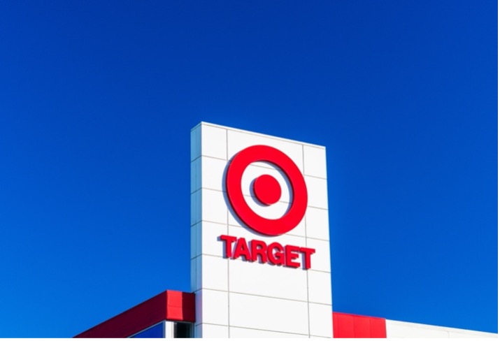
Take Target, for example; simple, profound and like many, has evolved slightly, undergoing a handful of modifications over the years. The bullseye is clean, crisp, concise, and consumer-friendly and sends the message from this now globally successful discount department store that the consumer will find what they are seeking: quality products at affordable prices paired with excellent customer service.
Although timeless and scalable, room for necessary adaptation and evolution post design and development overtime exists. Mindful adjustments and transformations, based on messaging upleveling, current trends, and spending shifts are often required as the markets vacillate and dictate.
The Starbucks logo is an obvious win. Minimalistic, yet monumental, like the name itself. The site straightforwardly states that ‘the siren is our muse, the face of our brand’; this siren seems to be doing her duty and due diligence luring billions of coffee-seekers worldwide to its front door. Logos often leave huge and intriguing clues to the original intention, foundation, history, and backstory of the businesses; Starbucks was once named Pequod, the ship’s name in Moby-Dick and evolved to Starbuck, a mate aboard Pequod. The name itself Star and Buck, additionally suggest heightened success, as in ‘shooting for the stars’ and in respecting the value of a dollar well-earned, well-spent and best invested.
Action for Traction:
I invite you to do a 10-minute brainstorm for your business and brand’s logo.
Take out a blank piece of paper or open a new google doc and create 7 columns:
Label them Mission, Message, Symbols, Colors, Feelings, Fonts, Companies (with great logos)
List specific words or colors that randomly come up for you during this focused contemplation and sort them in appropriate columns.
Take longer if you like but keep putting words on the page for at least the next 600 seconds.
You are creating the container for your logo; you are on your way to mindfully manifesting your company’s emblem that will be a key vehicle to your continued and ever-evolving success.


This is an awesome article. I appreciate the succinctly-put yet wide-scope, from imagery (‘magic button’) to detail (600 seconds). So often, in my experience of being a perpetual entrepreneur and advisor to dozens of companies, this fundamental aspect of brand-building /marketing /bus dev is under-appreciated or simply overlooked. I will share this article and save it for future use.